DE HOEK / THE HOOK
Citydressing Campaign. Hoek van Holland / Hook of Holland 2020 (NL
Hoek van Holland / Hook of Holland alias “De Hoek”, “The Hook” is a town in the southwestern corner of Holland (hence the name; hoek means "corner" and was the old word in use before the word kaap ("cape") became Dutch, from Portuguese cabo.), at the mouth of the New Waterway shipping canal into the North Sea. The town is administered by the municipality of Rotterdam as a district of that city.
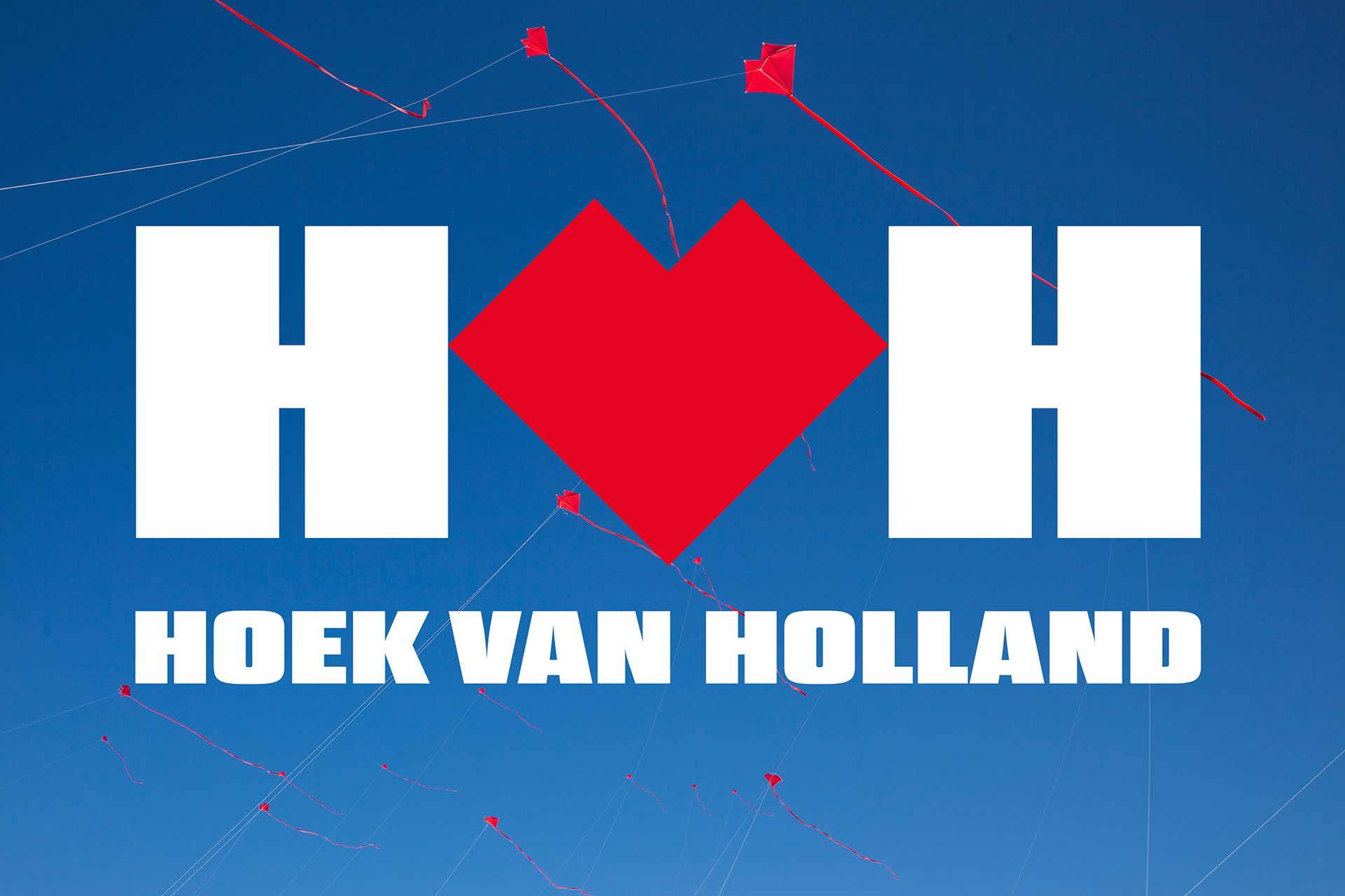
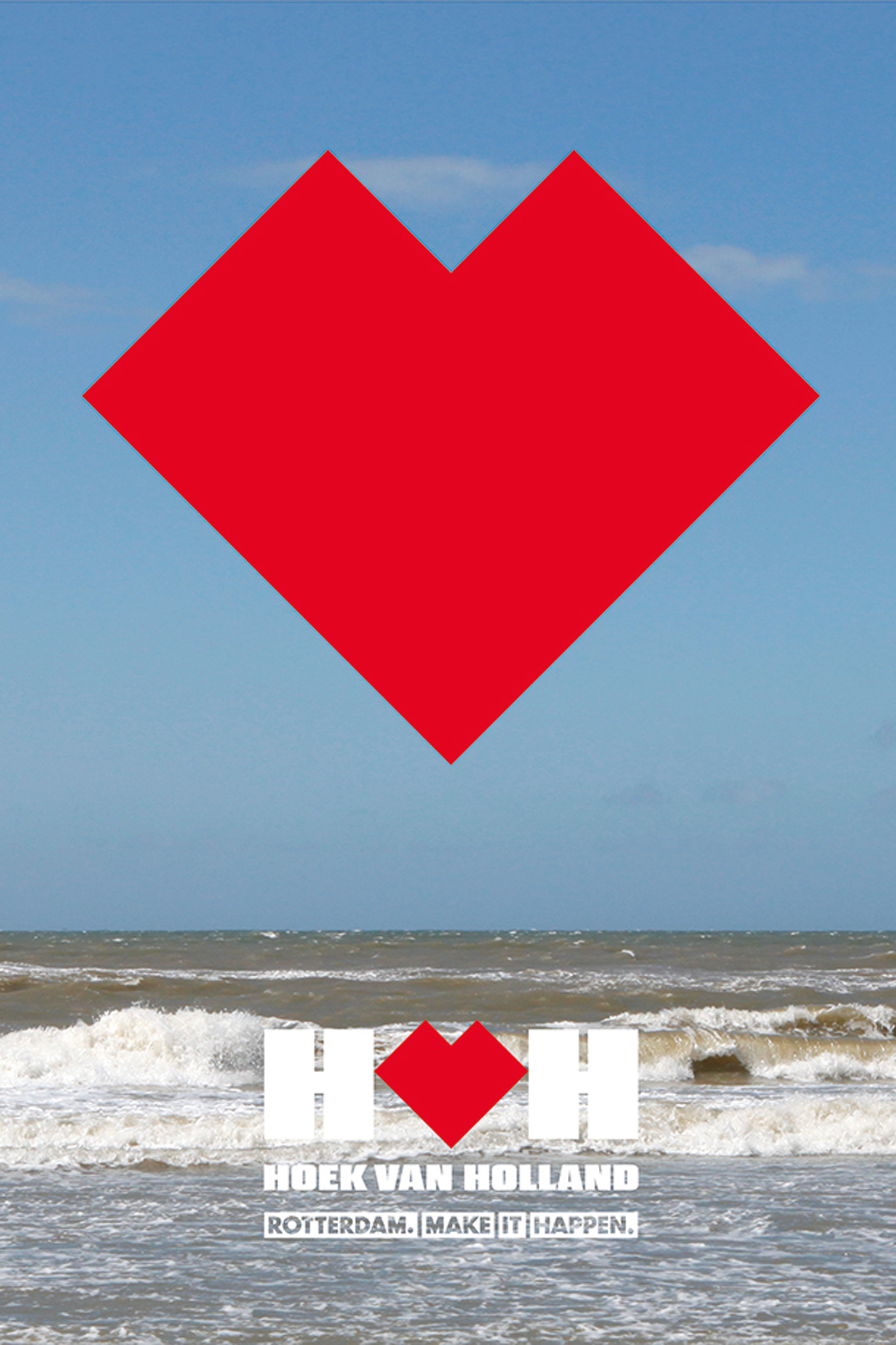
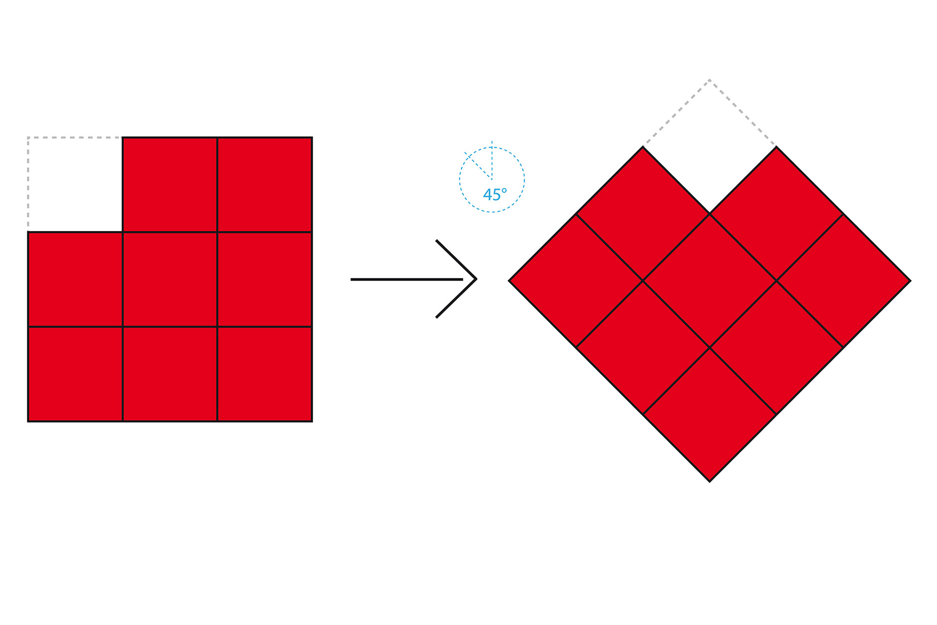
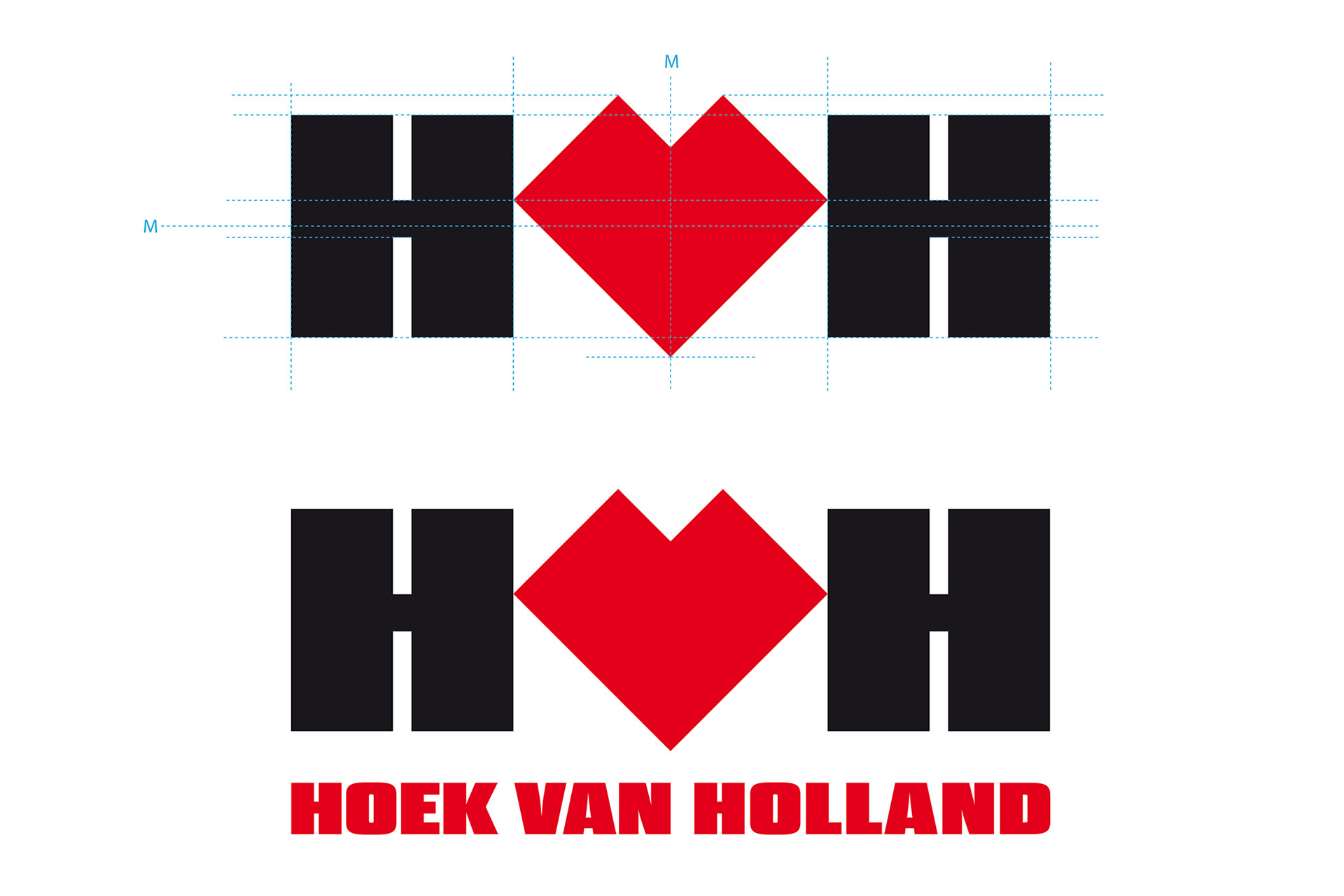
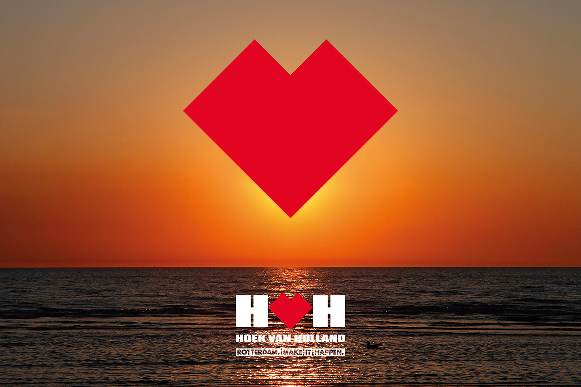
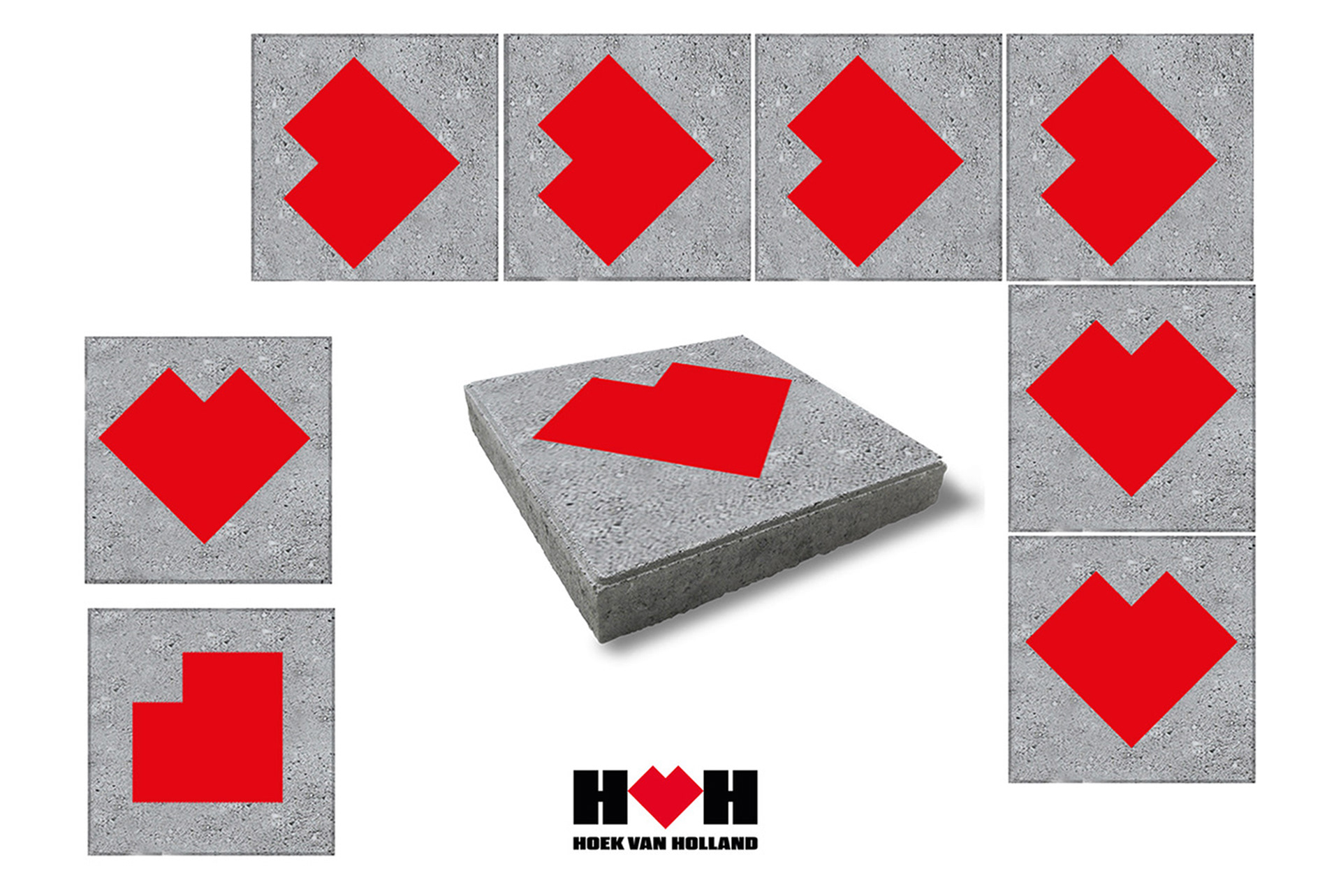
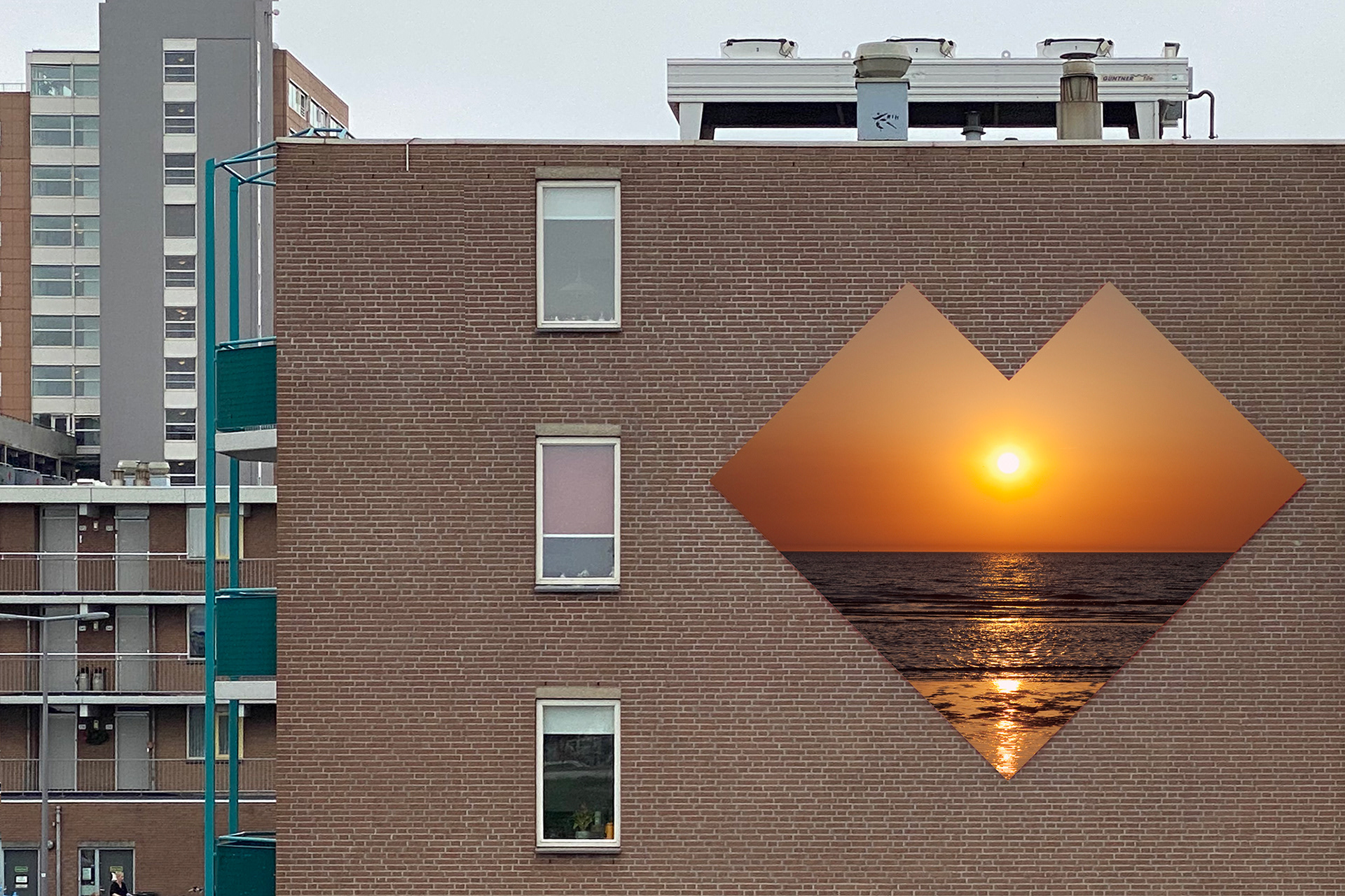
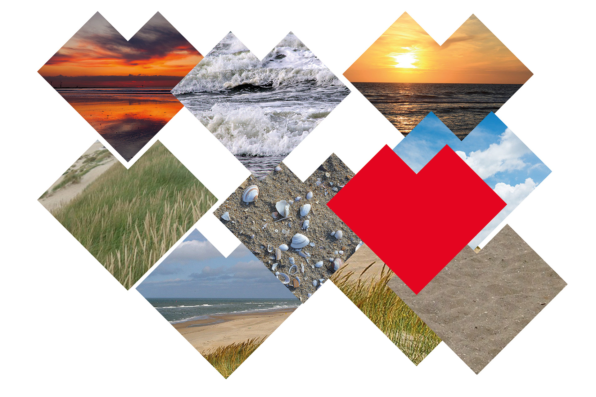
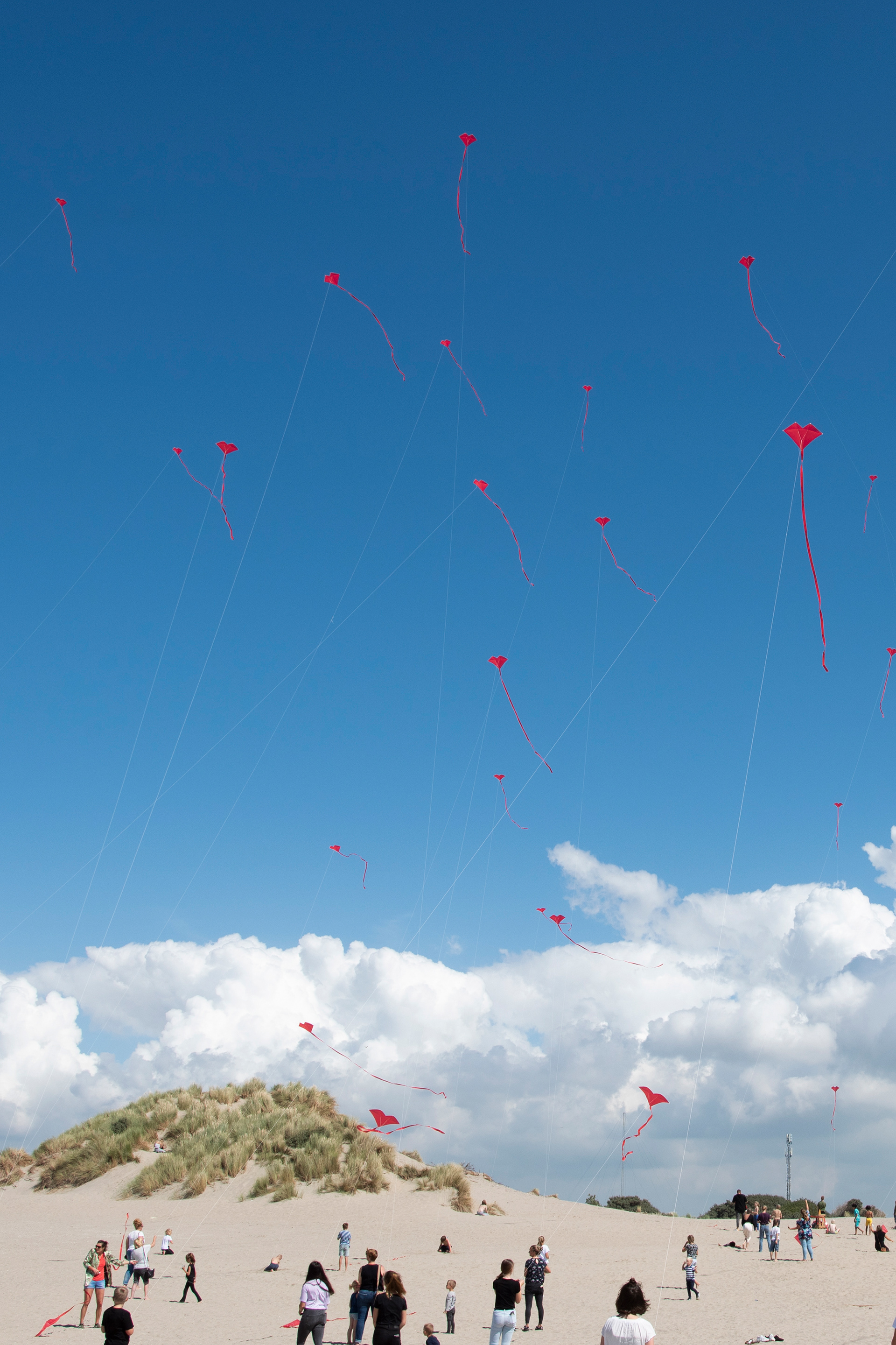
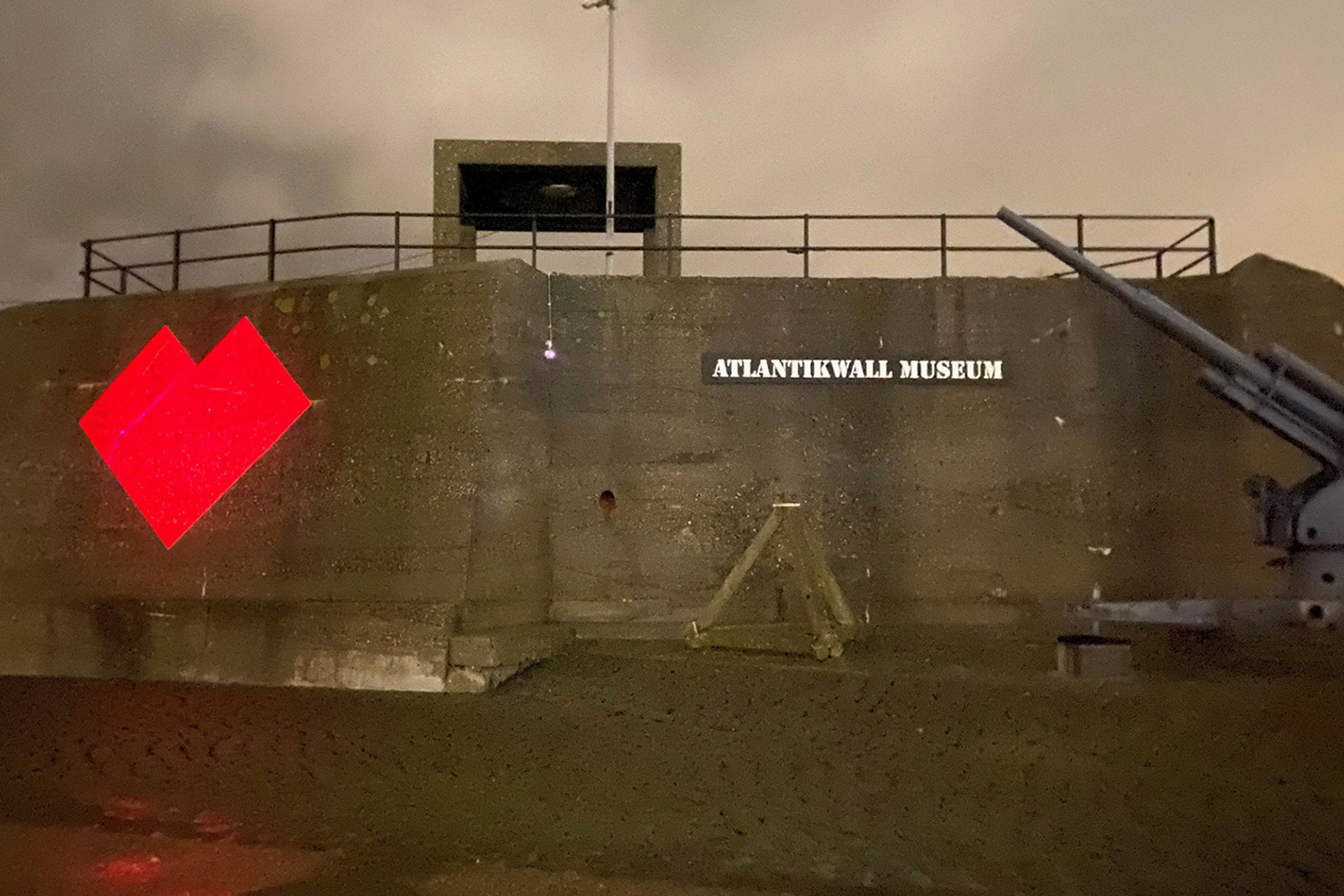
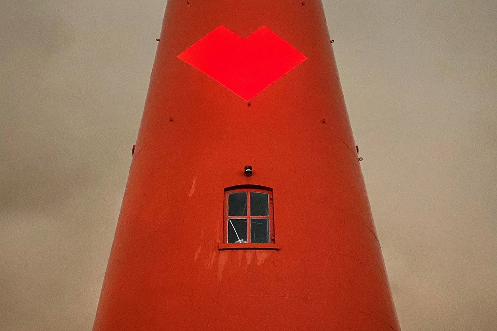
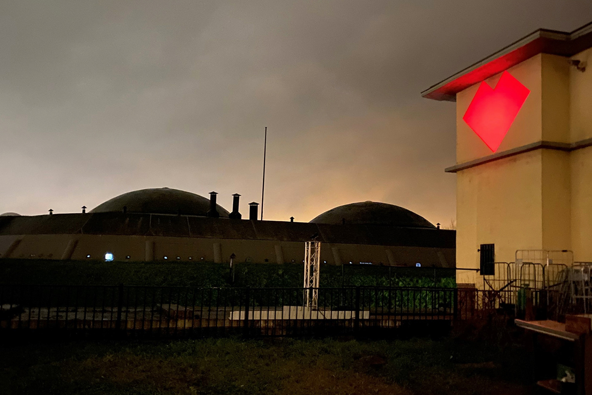
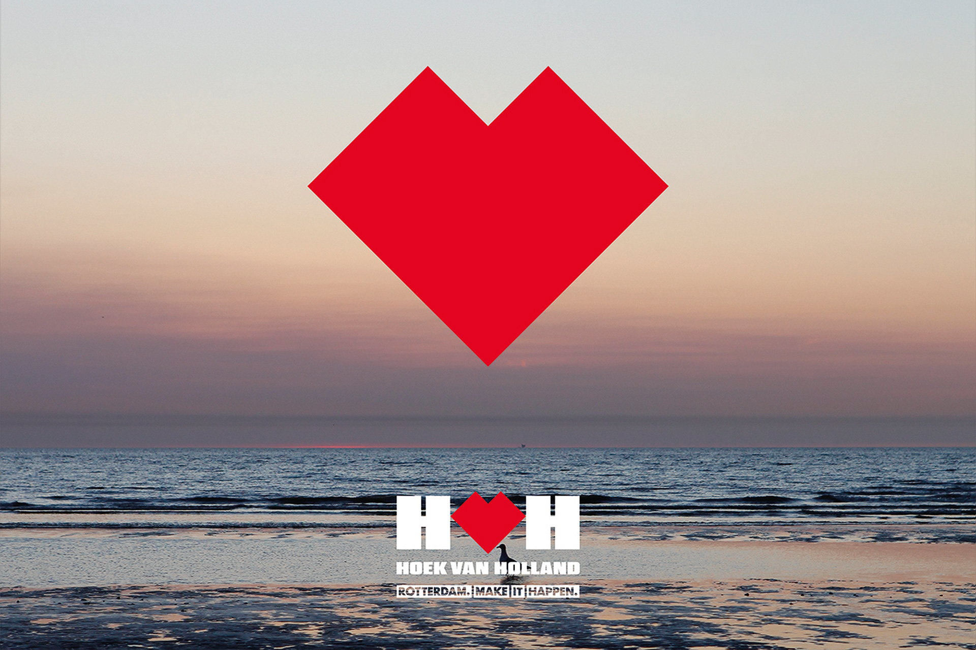
To start a new citydressing campaign, studio VOLLAERSZWART designed a new logo for Hoek van Holland. By turning a red corner 45 degrees a red heart-shaped logo is created: “The Hook” / “De Hoek”.
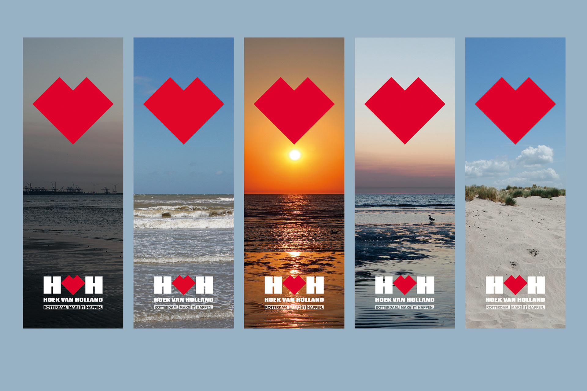
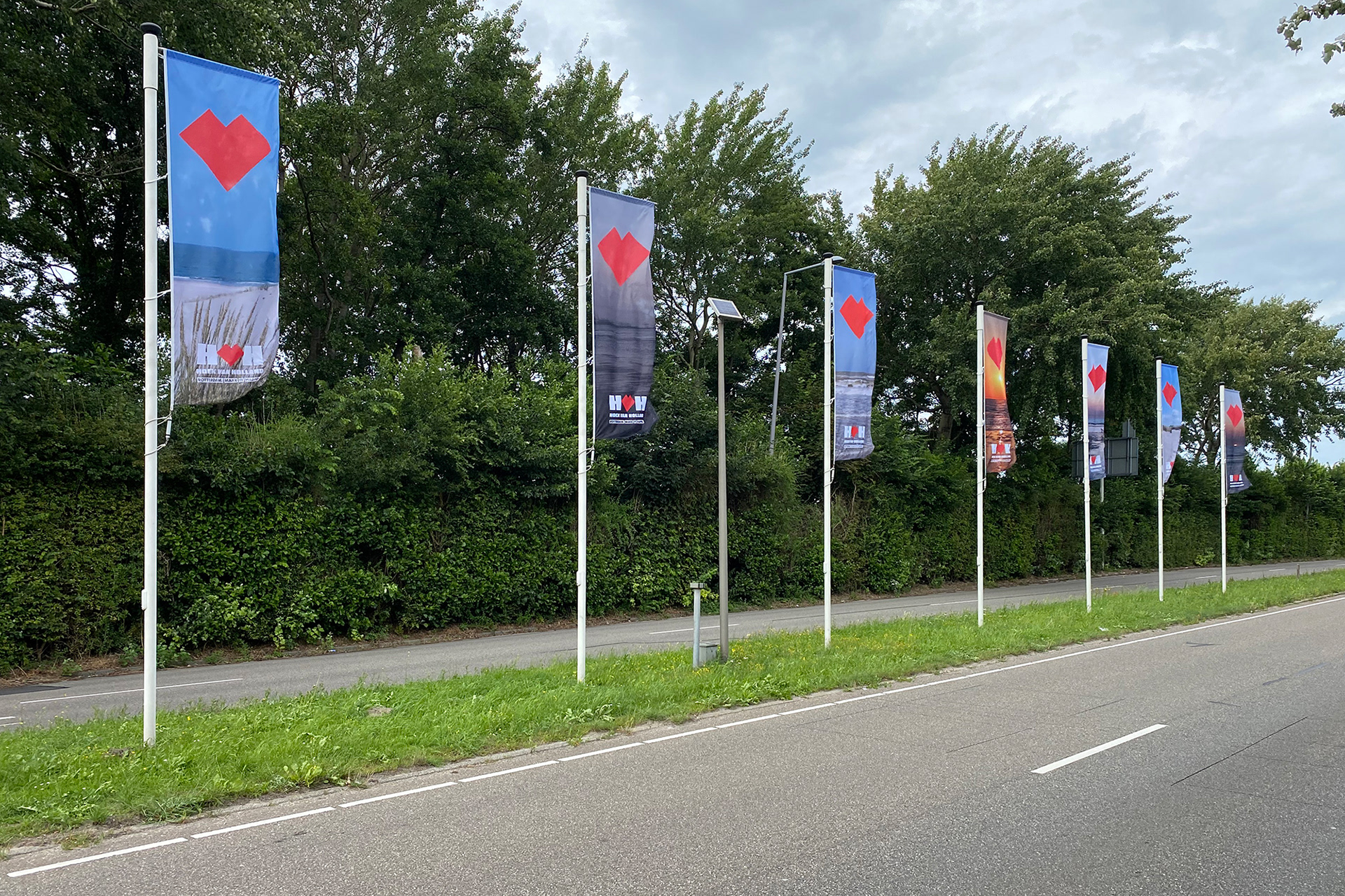
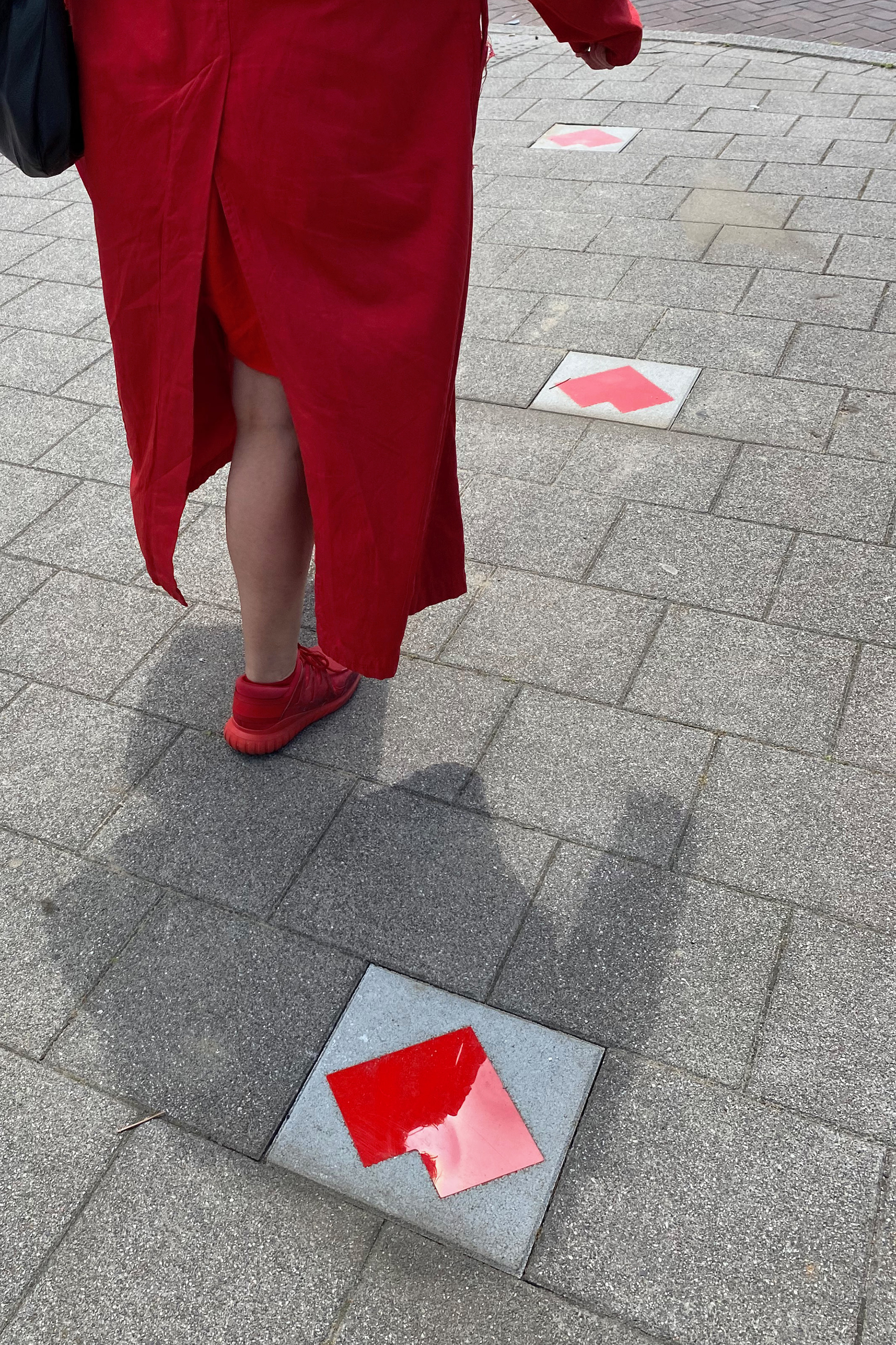
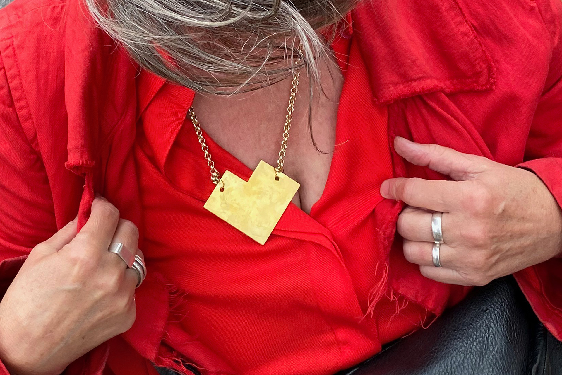
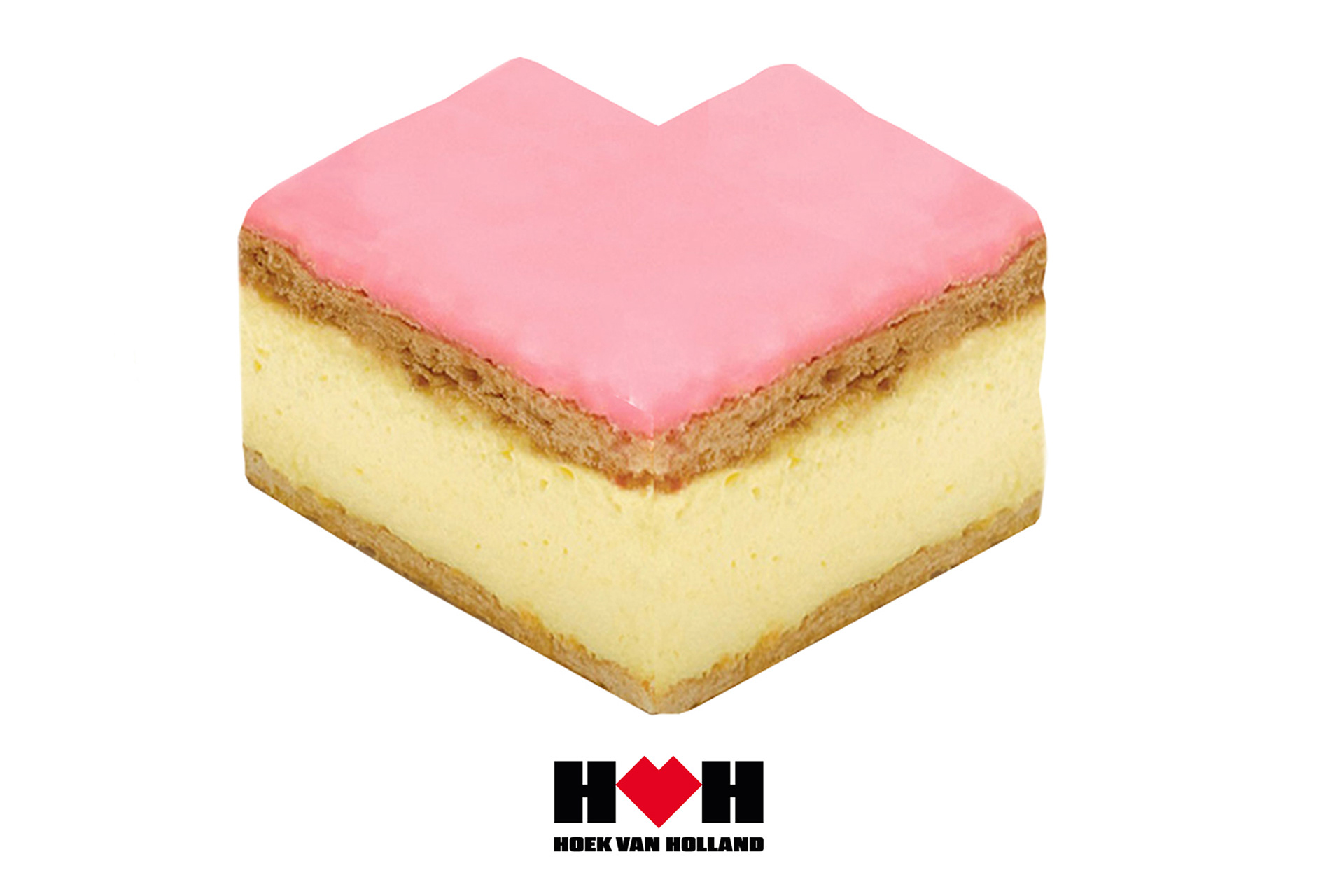
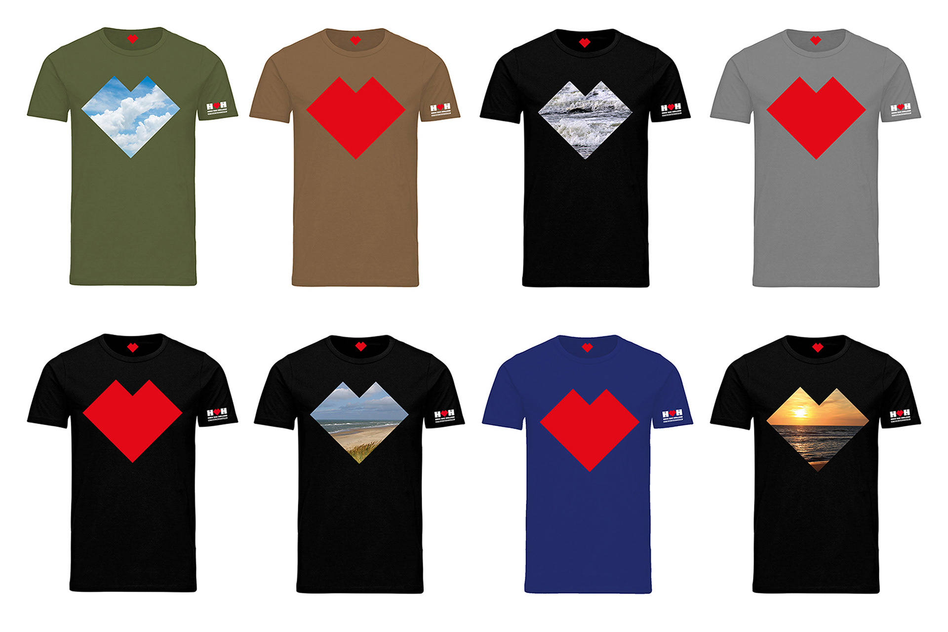
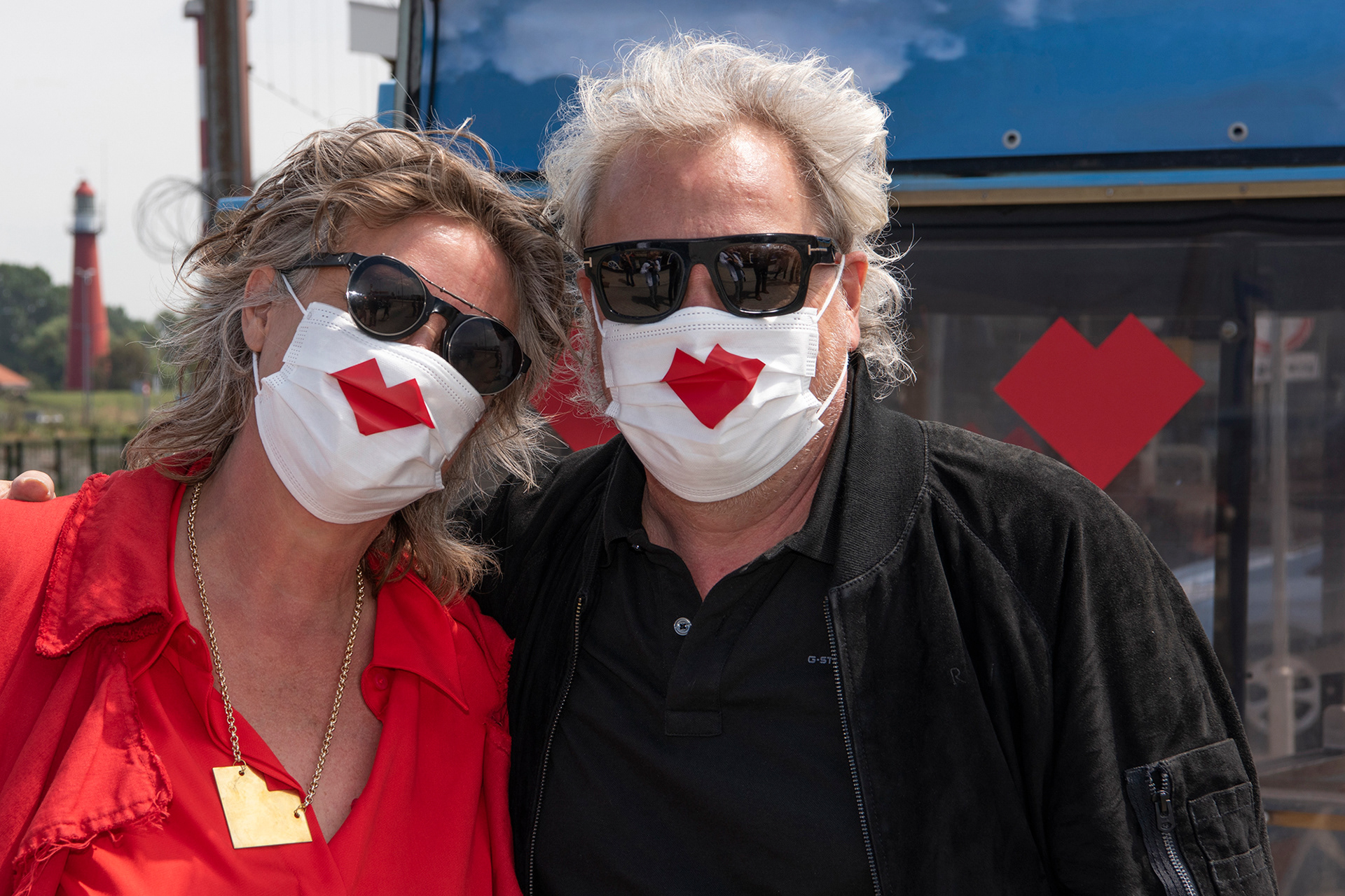
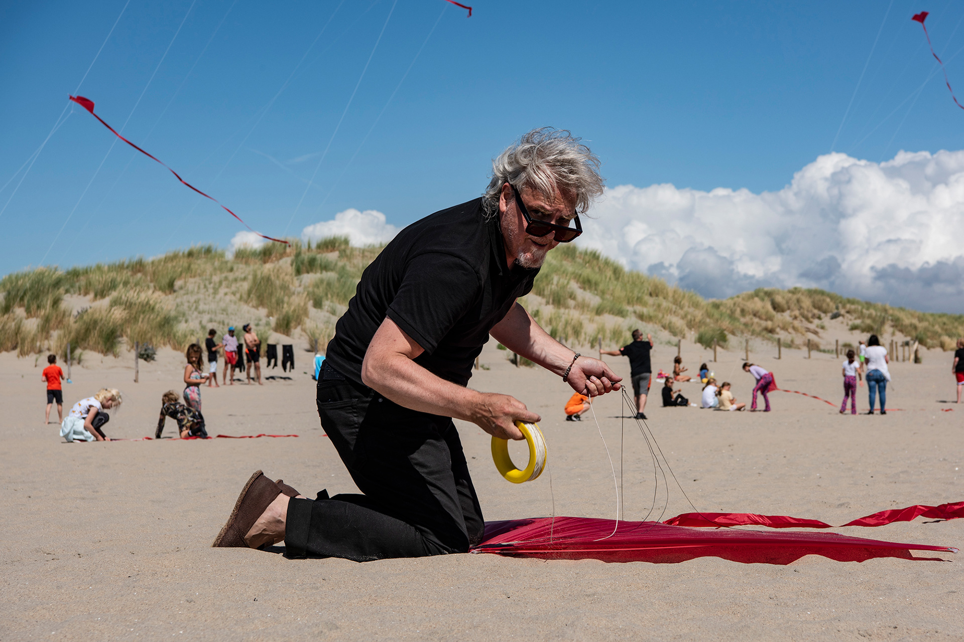
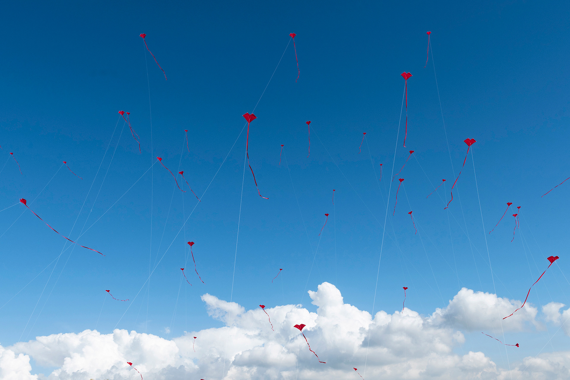
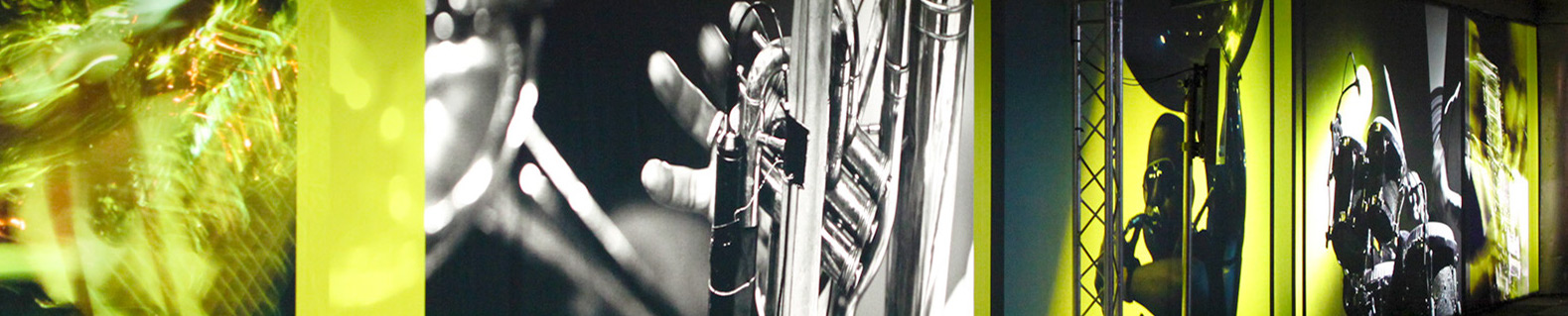
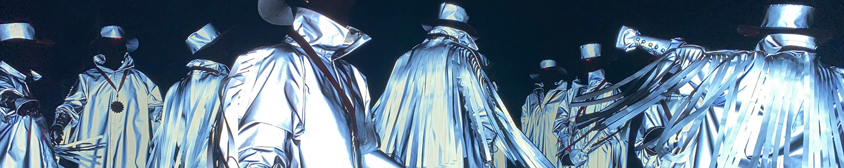
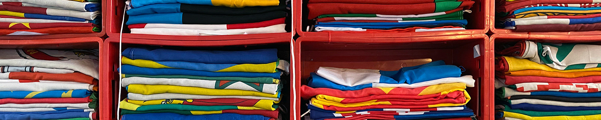
The new logo was introduced in various ways to trigger the inhabitants of Hoek van Holland to use the logo themselves to design new souvenirs, street objects, artworks, pastry, t-shirts or anything to promote their beloved beach town. The campaign started with road signage, flags and banners, eye-catchers on buildings, jewelry, cookies and a small kite event on the beach.
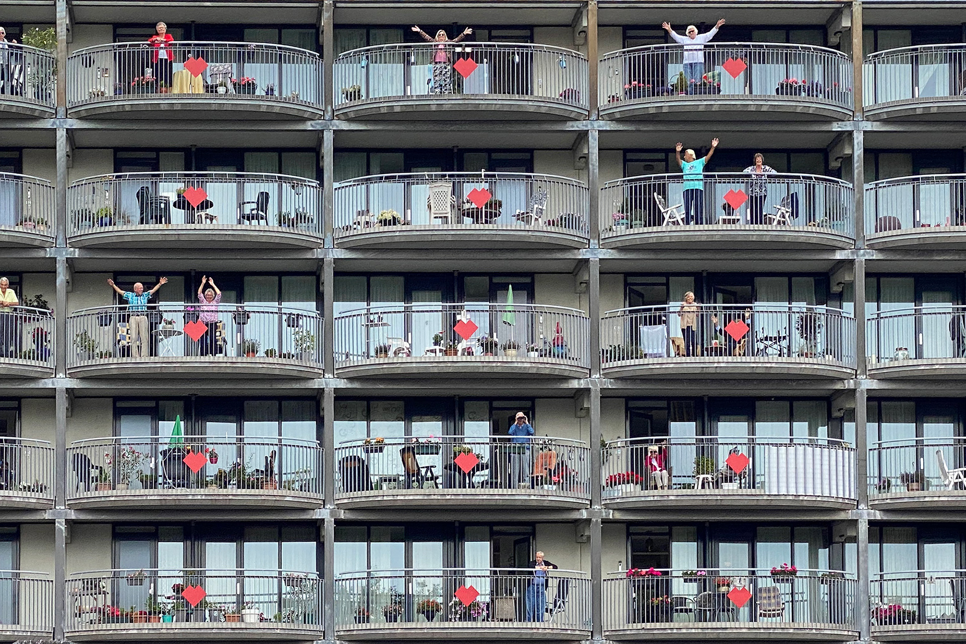
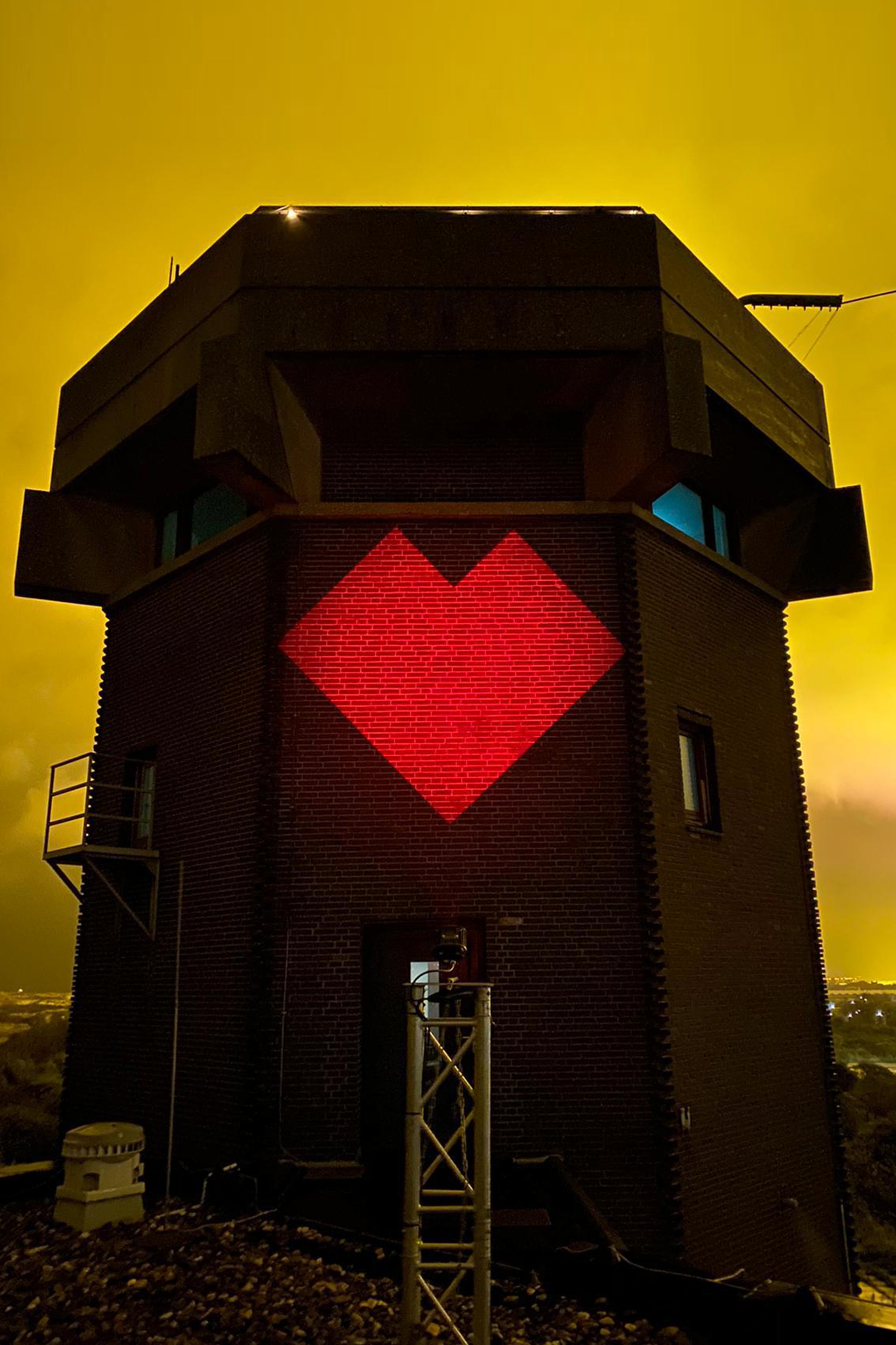
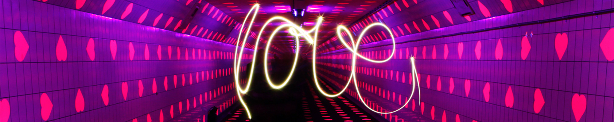
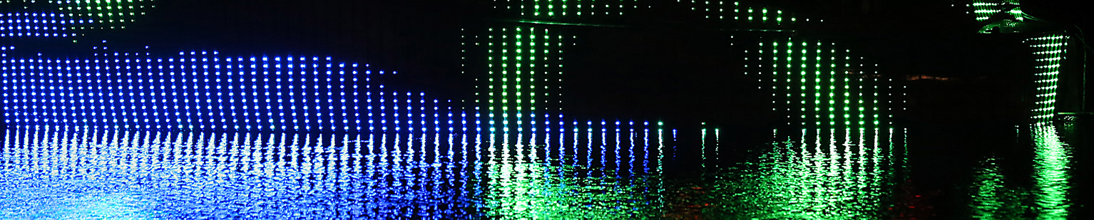
Last Christmas several buildings in the city were lit up by night with the red heart logo.